Logo showcase widget
Every feature of the logo showcase, and when to use it.
The logos of your clients, partners or press in a moving row, a grid or a carousel. Below is every feature in the four tabs, what it does and when it helps.
1. Logos
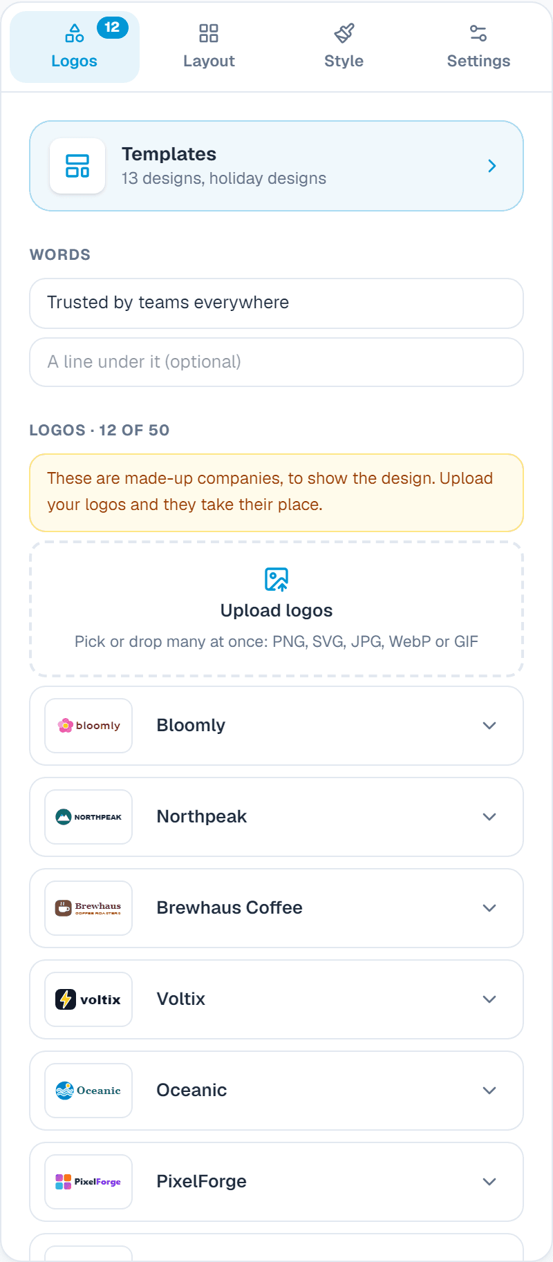
Templates
What it does: Ready-made designs at the top of the first tab. One click swaps the look and the example content; you then change the words.
When to use it: Start from a design that is close to what you want instead of an empty widget.
Words
What it does: A heading like Trusted by 2,000+ teams, and a line under it.
When to use it: Tells visitors why they are looking at the logos.
Logos
What it does: Pick or drop many at once (PNG, SVG, JPG, WebP or GIF), or paste a picture link. Each has a company name, a link (a site, mailto: or tel:) and an optional mark beside the name.
When to use it: Link each logo to the case study or the client's site.
Button
What it does: An optional button under the logos, like Become a partner.
When to use it: Turn interest into a lead.
2. Layout
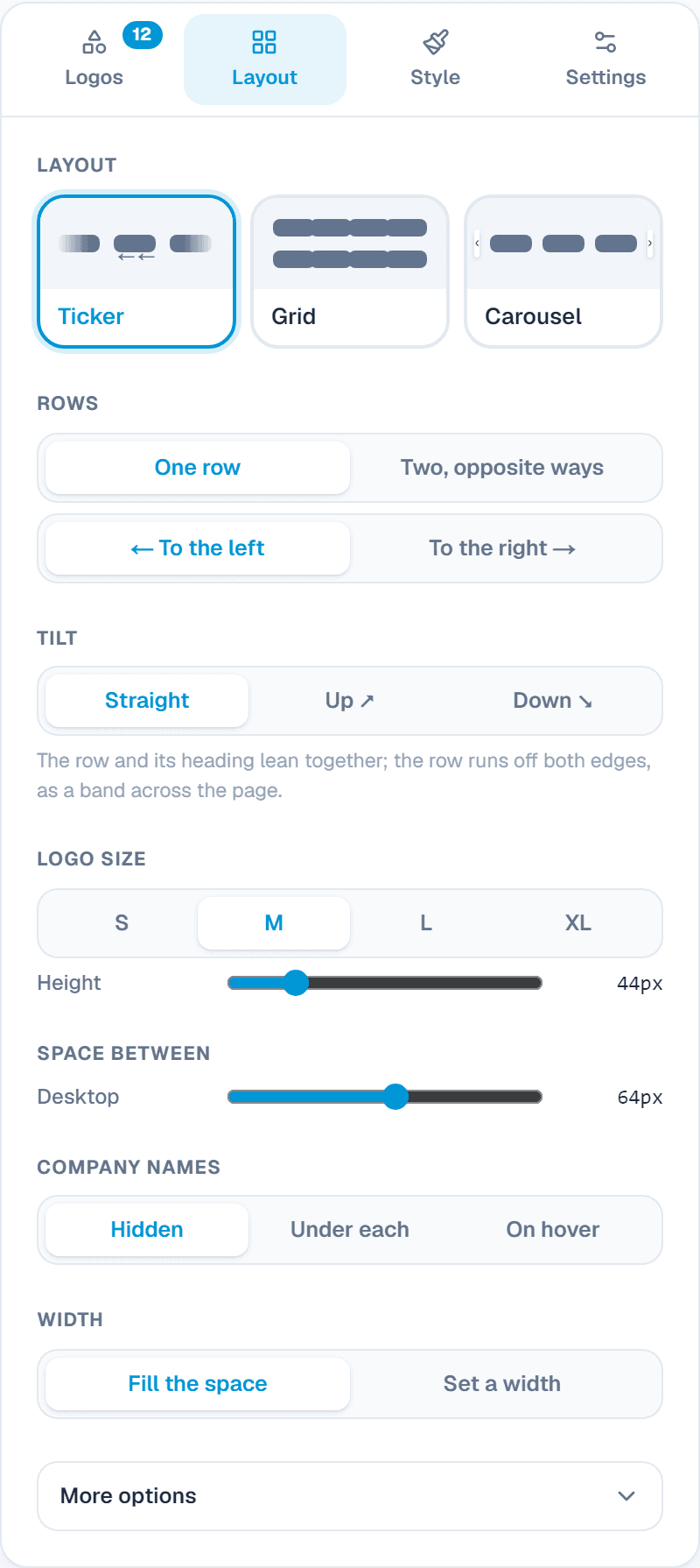
Layout
What it does: Ticker (a row that moves), Grid (stands still) or Carousel (slides with arrows or dots).
When to use it: Ticker under a hero banner; Grid on a clients page.
Rows and direction
What it does: One row or two going opposite ways, to the left or the right.
When to use it: Two rows going opposite ways look lively with many logos.
Tilt
What it does: Lean the row and its heading up or down, so it runs off both edges like a band.
When to use it: A bold, modern look for a landing page.
Logos in a row, size and names
What it does: The most in a row per device, logo height, space between, and company names hidden, under each or on hover.
When to use it: Names on hover help with logos people may not know.
3. Style
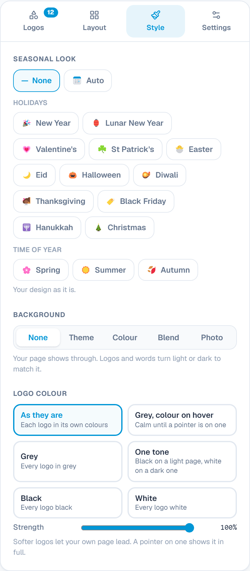
Logo colour
What it does: As they are, grey with colour on hover, grey, one tone (black on light, white on dark), black or white, and how strong.
When to use it: Grey or one tone makes logos of different colours look calm together.
On hover
What it does: Nothing, lift or grow.
When to use it: A small lift invites a click.
Band and cards
What it does: A strip of colour behind the row; a card behind each logo with a line or a shadow.
When to use it: White cards on a coloured band look neat.
Colours and font
What it does: Heading, names, button colours; your site's font, serif or mono; centred or left.
When to use it: Match your brand.
Seasonal look
What it does: Small holiday touches on the widget: New Year, Lunar New Year, Valentine's, St Patrick's, Easter, Eid, Halloween and more. Auto switches on its own around each holiday.
When to use it: A friendly touch for a few weeks a year, without making a new design.
Settings: the link and your own CSS
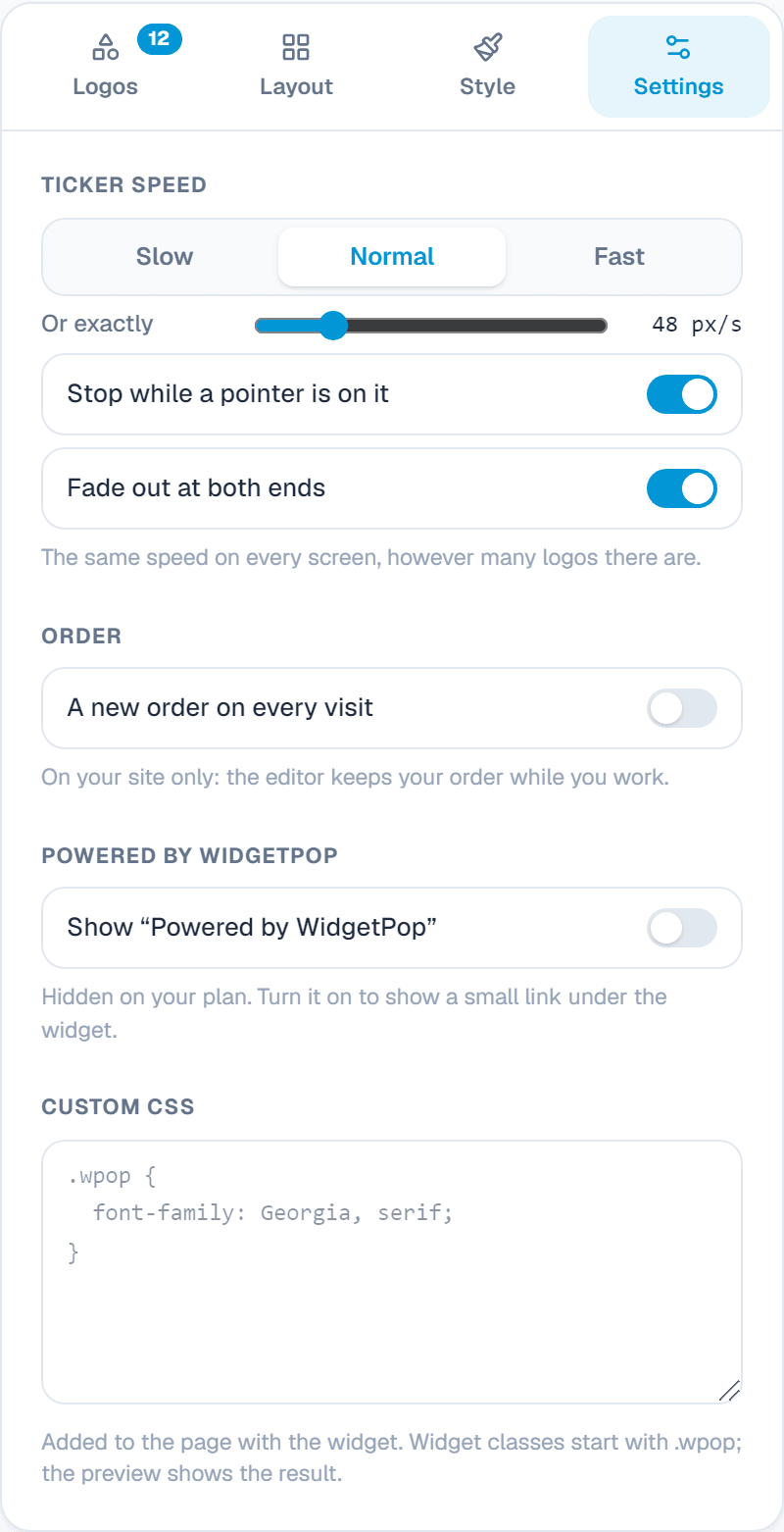
Ticker speed
What it does: Slow, normal, fast or exact, the same on every screen; stop while a pointer is on it; fade out at both ends.
When to use it: Slow lets people read the logos.
Carousel
What it does: Arrows, dots and sliding by itself.
When to use it: Dots for phones; arrows for computers.
Order
What it does: A new order on every visit.
When to use it: Fair to every client when you have many logos.
Powered by WidgetPop
What it does: A small link under the widget. The Free plan always shows it; on a paid plan it is hidden unless you turn it on.
When to use it: Keep it hidden on a paid plan so the widget carries only your brand.
Custom CSSPaid plans
What it does: Your own CSS rules for this widget. Its classes start with .wpop, and the preview shows the result.
When to use it: For designers who need an exact font, size or spacing that the editor doesn't offer.
Add it to your website
In the Install tab, add your website's address under Allow your website, copy the code and paste it where the widget should appear. Every change you save shows on your site by itself.
About this widget
Related guides
Still need help?
Tell us what you're trying to do. A real person replies, usually within one working day.