Google reviews widget
Every feature of the Google reviews widget, and when to use it.
Shows your business's real Google reviews on your website, with your rating and a Write a review button. New reviews come in by themselves. Below is every feature in the five tabs, what it does and when it helps.
Make one
- 1New widget, Google Reviews. Type your business name and pick it from the list.
- 2Go through the tabs from left to right: Layout, Content, Colors, Style and Settings. The preview shows every change at once.
- 3Press Save, then add it to your website from the Install tab.
1. Layout: which reviews, and how they sit
Templates
What it does: Ready-made designs at the top of the first tab. One click swaps the look and the example content; you then change the words.
When to use it: Start from a design that is close to what you want instead of an empty widget.
Design
What it does: Carousel (slides sideways with arrows), Grid (cards in rows), List (one per row), Masonry (Pinterest style), Quotes (big testimonial text), Showcase (one big review, the rest around it), Badge (just your Google rating) or Floating badge.
When to use it: Carousel for a home page where space is short. Grid or Masonry for a reviews page. Quotes for a short, bold section. A badge where there is room for one line.
Badge
What it does: Your Google rating in your page, in four styles: Card (Google Reviews, your rating, stars, Excellent and the count), Pill (one slim line), Button (Google Reviews and your score) or Faces (your reviewers' photos, then your rating). Put it on the left, in the centre or on the right.
When to use it: Shows your rating next to a Book or Buy button, in a header or a footer, without taking the room of a full widget.
Floating badge
What it does: The same badge, floating in a corner or at the middle of a side of the screen, with your own gap from the edges. It can come in at once, after some seconds, or when the visitor has scrolled part of the page. Choose the pages (contains, is exactly, starts with, ends with) and the devices: desktop, mobile or both. On phones it is smaller, and visitors can swipe it away.
When to use it: Keeps your rating in view on every page while people browse, without changing your page.
Badge: on click
What it does: A click on either badge opens your reviews in a popup with the same review cards, opens your Google page, or does nothing. On a phone the popup is a sheet from the bottom of the screen.
When to use it: The popup keeps visitors on your site while they read your reviews.
Badge: rotating review and Write a review
What it does: The Card can show your 5-star reviews as one short line, with who wrote it, that changes every few seconds. The Card, Pill and Faces can carry a Write a review button that opens Google's review form. Visitors who ask for less motion see one review that stays.
When to use it: A real customer's words catch the eye more than a number. The button brings in new reviews.
Carousel: autoplay and cards per view
What it does: The carousel can move on every few seconds (it waits while someone hovers or touches it), and show 1 to 4 cards at a time, or as many as fit (Auto).
When to use it: Turn autoplay on so visitors see more reviews without pressing arrows. Auto suits most pages.
Background
What it does: Theme (a soft panel), Transparent (sits on your page, the text turns light or dark to match) or Custom (any colour).
When to use it: Transparent blends into your page. Use a panel or a colour to make the reviews stand out as a section.
Reviews to show
What it does: How many reviews the widget shows. Free shows your best 10; paid plans keep your latest 100.
When to use it: 6 to 9 is plenty for a home page; show more on a dedicated reviews page.
Star rating
What it does: Show 5-star reviews only, 4 stars and up, 3 and up, or all of them.
When to use it: 5 only is the usual choice. Pick 4+ if you have few reviews, so good 4-star ones show too.
OrderPaid plans
What it does: Newest first or most relevant (Google's order).
When to use it: Newest first shows people your business is active today.
FiltersPaid plans
What it does: Hide reviews that mention some words or names, show only reviews that mention some words, or only reviews with photos.
When to use it: Hide a review that names a staff member who left, or show only reviews that mention a service on that service's page.
Choose reviewsPaid plans
What it does: Hide any review and pin your favourites to the front, one by one.
When to use it: Put your most convincing reviews first, and take off any review you don't want on your site.
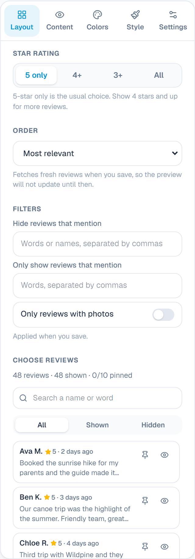
Hide or pin single reviews (paid plans)
Under Choose reviews you see every review the widget has: your latest 100 on paid plans. Press the eye to hide one, or the pin to put it first. Up to 10 can be pinned. The preview changes straight away; press Save changes to put it on your site.
Only reviews with words are shown; a star rating with no text is left out. Hiding a review here doesn't touch it on Google.
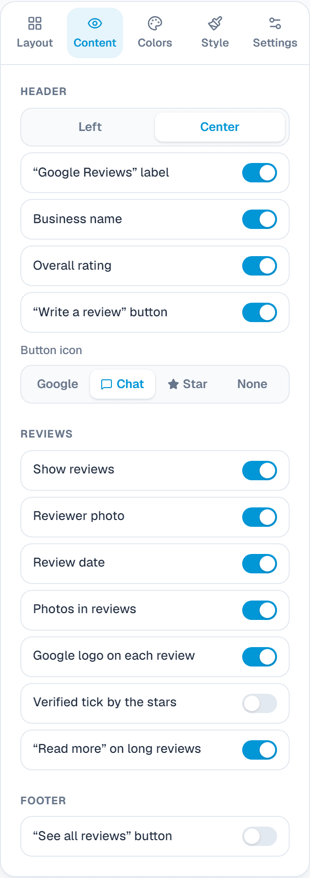
2. Content: what each part shows
Header
What it does: Your business name, overall rating, the Google Reviews label and a Write a review button, aligned left or centred. Each part can be turned off.
When to use it: Keep the rating and the Write a review button: they build trust and bring new reviews.
Reviews
What it does: Reviewer photo, date, photos in reviews, the Google logo, a verified tick, Read more on long reviews and a Load more button, each on or off.
When to use it: Turn off dates if your reviews are a little old. Keep photos: they make reviews feel real.
Footer
What it does: A See all reviews button that opens your Google page, on the right or full width.
When to use it: Lets curious visitors read everything on Google.
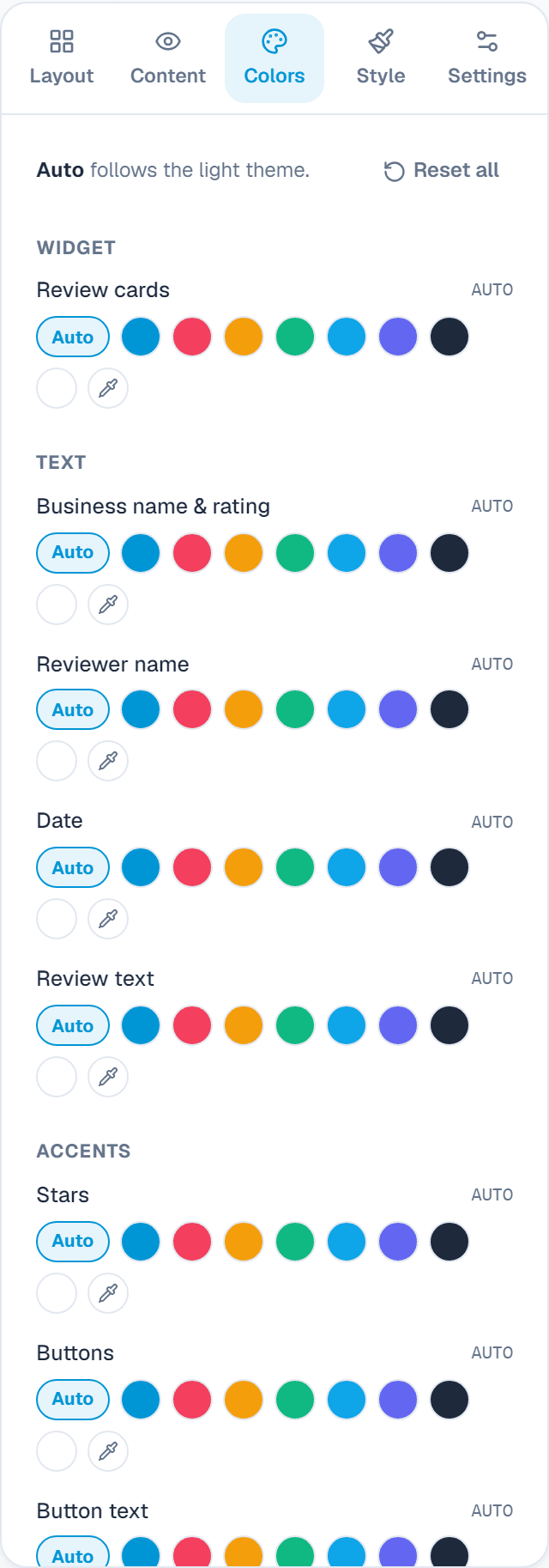
3. Colors
Colours
What it does: Background, review cards, business name and rating, reviewer name, date, review text, stars, buttons and button text, plus arrows and pagination. Auto follows the theme. On a badge, Review cards is the badge's background, and Light or Dark sets its theme.
When to use it: Match your brand colours so the widget looks like part of your site.
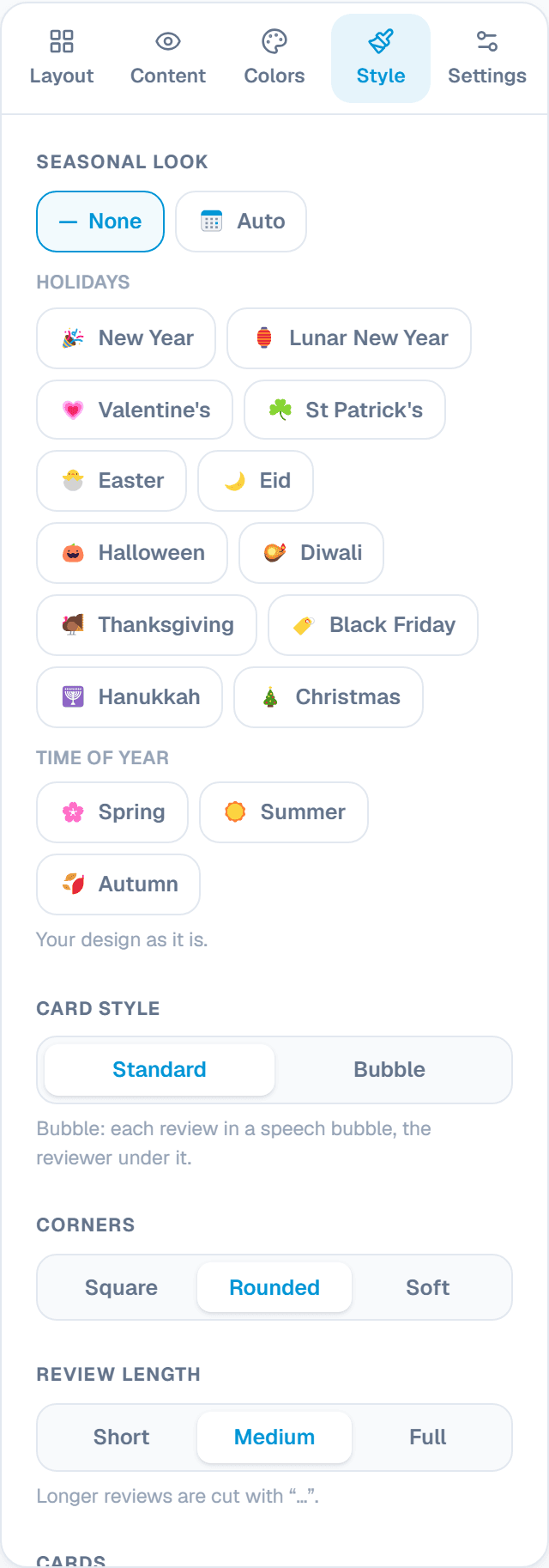
4. Style
Card style
What it does: Standard cards, or Bubble: each review in a speech bubble with the reviewer under it.
When to use it: Bubble feels more personal, like a conversation.
Corners, border and shadow
What it does: Square, rounded or soft corners, and a border or shadow on each card.
When to use it: Soft corners and a light shadow suit most modern sites.
Review length
What it does: Short, medium or the full review. Longer reviews are cut with an ellipsis.
When to use it: Short for a carousel, so cards stay even; full on a reviews page.
Review text
What it does: Bold or italic text.
When to use it: Italics make reviews read like quotes.
Arrows and pagination
What it does: Show arrows, and dots or a page number under a carousel.
When to use it: Dots tell visitors there is more to see.
Seasonal look
What it does: Small holiday touches on the widget: New Year, Lunar New Year, Valentine's, St Patrick's, Easter, Eid, Halloween and more. Auto switches on its own around each holiday.
When to use it: A friendly touch for a few weeks a year, without making a new design.
Settings: the link and your own CSS
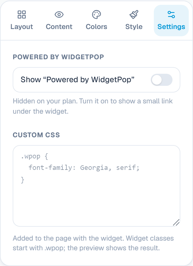
Powered by WidgetPop
What it does: A small link under the widget. The Free plan always shows it; on a paid plan it is hidden unless you turn it on.
When to use it: Keep it hidden on a paid plan so the widget carries only your brand.
Custom CSSPaid plans
What it does: Your own CSS rules for this widget. Its classes start with .wpop, and the preview shows the result.
When to use it: For designers who need an exact font, size or spacing that the editor doesn't offer.
Add it to your website
In the Install tab, add your website's address under Allow your website, copy the code and paste it where the widget should appear. A floating badge takes no room: paste its code once, just before </body>, on every page where it may show. Every change you save shows on your site by itself.
About this widget
Related guides
Still need help?
Tell us what you're trying to do. A real person replies, usually within one working day.